Thom Sevalrud makes Luerzer's Archive Best Illustrator list, again.

  How do you manage to be named one of the top 200 Best Illustrators Worldwide by Luerzer's Archive, for a second time?  We asked Thom Sevalrud, a master of conceptual illustration, to help us understand his methods and inspiration for his most recent award-winning image 'The Elephant' depicting big data analytics.


i2i Art:  Let's start from the beginning.  How were you approached to create an illustration representing Big Data Analytics?

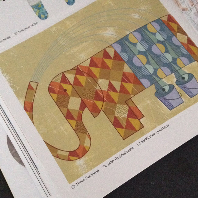
Thom Sevalrud:  This image was created for the McKinsey Quarterly publication. It was to be a double-page spread to accompany a whole ‘section’ in the journal examining big data analytics. The AD, Jake Godziejewicz, had sent me the articles and a short brief that explained what they needed; including some very specific examples of mine that showed the approach they preferred.


i2i Art:  Why an elephant?

Thom Sevalrud:  I wanted to nail a perfect image of something big, yet something multi-faceted. It all came together fairly quickly once the water provided the metaphor for ‘washing away the complexities’ of data. I sent the idea to Jake and explained that the elephant image would be a perfect way to ‘over-fill’ a double page spread with both sides of the creature being cropped off the page……like it didn’t fit.  I'm glad Jake loved the idea.


i2i Art:  Was this painted traditionally?

Thom Selvarud:  It was acrylic on paper, then I added a subtle binary code into random areas of some of the diamond shapes in the elephant using digital tools.


i2i Art:  And how did you get the nod from Luerzer's Archive?

Thom Selvarud:  At about the time I was working with McKinsey Quarterly, I was invited to once again submit to Luerzer’s Archive 200 Best Illustrators Worldwide. Illustrators are first nominated and screened before they are invited to enter. Their work is then taken to another level of judging and are chosen from an international collection of work, where my elephant made the cut. I have now been included in 2 of the 5 collections of The Best Illustrators by Luerzer’s Archive.

©Thom Sevalrud_TS282_i2iArt'The Elephant' as it appears in Luerzer's Archive 200 Best Illustrators Worldwide

Thom Selvarud in Luerzer's Archive

Thom Sevalrud is represented by i2i Art Inc. | View Thom Sevalrud's complete portfolio

Thom Sevalrud for 88 Scott

The vision for 88 Scott :  "These are the dreamers, the planners, the creators. ... In the earliest planning stages of 88 Scott, fifteen of the country's leading architects, planners and developers were invited to collaborate in a unique process. Their mandate was to create a bold vision for an exceptional, new landmark condominium building..."  

In keeping with this creative approach, art by nine local i2i artists was reproduced in large format and presented on hoarding panels (divided by inspirational quotations).  The idea was for the developer to support local talent while beautifying the site during the construction phase of development.  The images were chosen to represent the many facets of life in the immediate community:  green space, culture, recreation, shopping, entertainment etc.

Over the coming weeks we'll bring you pics of the other panels, but we start today with Thom Sevalrud's.  It's fantastic to see the art at this size!  If you have a chance, pop down and check out the larger-than-life art at 88 Scott in the heart of downtown Toronto.  To see more of Thom's art go here.

©Thom Sevalrud_TS216_i2iArt
©Thom Sevalrud_TS232_i2iArt
©Thom Sevalrud_TS227_i2iArt

Thom Sevalrud's Surface Design Recognized by American Illustration

Thom Sevalrud's 'Abstractions' were recognized by American Illustration and chosen for their website award archive. The clean graphic images were used in different configurations as surface design on gift bags for the annual Buddies In Bad Times Art Auction last fall.  Congratulations Thom!

©Thom Sevalrud_TS307_i2iArt

Thom Sevalrud for Global Brief

  Louis Fishauf commissioned Thom Sevalrud to create this conceptual cover for Global Brief.  Thom also created another feature piece for the interior on Misunderstanding Canadian Multiculturalism. To learn more you can visit Global Brief's site here.  Check out Thom's update portfolio here.

©Thom Sevalrud_TS284_i2iArt
©Thom Sevalrud_TS285-a_i2iArt

Thom Sevalrud: Big Data

  The Wikipedia definition of Big Data is:  "a collection of data sets so large and complex that it becomes difficult to process using on-hand database management tools..."

Thom Sevalrud has a way with taking just this type of complexity and in his very unique visual vocabulary communicating the idea clearly, like no other.  That's why  Brian Donahue of Be Design called upon Thom to illustrate Why Big Data is a Big Deal for Macalester Today.  Brian is also a big fan of Thom's hand lettering so he also asked him to illustrate the headline for this feature as well.

MacTodayWinter1_Thom_Sevalrud_i2iart
MacTodayWinter2_ThomSevalrud_i2iart
MacTodayWinter3_ThomSevalrud_i2iart

i2i Artists Support LGBT Youth Line

i2i artists Thom Sevalrud, Ian Phillips and John Webster are 3 of 20 artists and designers commissioned by Shaun Moore of MADE  to create custom auction paddles for the Lesbian, Gay, Bi, Trans, Youth Line's upcoming yearly Line Art Auction taking place November 6th at the Neubacher Shor Gallery. Ian Phillips' paddles inspired by his beloved dog and muse, Fancy Polanski, RIP.

'IPAuctionPaddles' illustration ©Ian Phillips/i2iart

John Webster's paddles, everything Webster wonderful...do I hear bling, bling?

'JWAuctionPaddles' illustration ©John Webster/i2iart

Thom Sevalrud says, "The concept for my paddles was influenced by Semaphore signalling flags. I used the Semaphore alphabet to create the word YOUTH. Then I took liberties with the designs by 'complicating' them with flamboyant and crazy patterns that I made myself. The overlaying word QUEER is meant to complete the visual statement to go along with the symbolic representations to form the words QUEER YOUTH. Defiant, colorful and individual!".

'TSAuctionPaddles' illustration ©Thom Sevalrud/i2iart

[pinterest]