
Inspired by ideas, Ane is thrilled at the chance to tackle tough topics. Producing a range of artwork on a variety of subjects, from the climate crisis to mental health, they have a knack for delivering complex concepts with clear and concise visuals. Ane’s illustrations tell a story, with bold colour palettes and graphic shapes guiding the viewer. Whether its a detailed map or a simple visual, Ane definitely doesn’t shy away from making a statement. In fact, they embrace it!
Read More
Clare Owen illustrates for Anyday Cookware
Who doesn’t love making meal time easier? Well, Anyday Cookware is here to help! Their innovative microwavable dishes have revolutionized microwave-cooking, introducing a new way to explore our inner foodie. Working with Anyday founder Stephanie Chen and design agency Character, illustrator Clare Owen created spectacular on-brand illustration from ingredients, step-by-step visuals to the dish itself. Inspired recipes are accompanied by Clare’s vibrant art. Using pops of colour and subtle textures her style is the perfect companion to this contemporary line of cookware.
Read More
Rémy Simard illustrates for Crave
Funny and relatable. Just a couple of things that illustrator Rémy Simard has in common with iconic 90’s sitcom F · R · I · E · N · D · S. The focus of a recent marketing project by Bell Media for Crave, Rémy's illustration depicts some of the most memorable episodes of the series. His distinct comic style gives way to an endearing comedic flair that perfectly captures the humour in each familiar icon. Which, when combined reveals a famous F · R · I · E · N · D · S episode. The one with the….
Read More
Gary Alphonso illustrates for Oolitic American Gin
Digital scratchboard master Gary Alphonso is at it again! This time, for Oolitic American Gin. Gary collaborated with Art Director Lars Lawson of Timber Design Co. to capture the origin and history of this Indiana made, limestone filtered gin. No detail spared, Gary’s illustrative precision is evident in each stroke, collectively illuminating the highlights, shadows and depth of the 1920’s American quarry
Read More
Clare Owen illustrates for FabFitFun
With fall festivals and harvest hay rides in full swing, autumn is definitely in the air. Inspired by her favourite season, Clare Owen had no trouble digging into the illustrations for these fall 2018 FabFitFun boxes.Clare’s feminine style perfectly captures the whimsical essence of fluttering fall leaves, only enhanced by the the natural beauty of the vibrant autumn colours.
Read More
Illustrator Eric Chow featured in Communication Arts Illustration Annual
A BIG congratulations to illustrator Eric Chow for being featured in Communication Arts Illustration Annual 2018! Eric’s work for The Infinite Bad, a role-playing horror comedy podcast created by Definitely Human Productions promotes the series online and through social media.
Read MoreDave Murray illustrates Toronto for Airbnb
The folks at trevor//peter were coordinating a series of events for Airbnb this summer and they needed a wow factor. Taking place in the heart of Toronto, Canada the team decided a map of the city - 10 feet x 15 feet - would be the perfect way to draw the crowd to their booth.
Illustrator Dave Murray, a proud Torontonian, was chosen to work on the project. Dave quickly assembled a brilliant collage of Toronto's coolest neighborhoods and points of interest. Graphic, bold, colorful, the piece beckons you to point out where you live or where you need to visit.


Check out more of Dave Murray's illustration. Represented by i2i Art Inc.
Katy Dockrill for LCBO 'Hello Spring' Campaign
Nothing symbolizes Spring quite like a cherry blossom. When you walk into any LCBO this month you will be greeted by the bright and simple beauty of this bloom. Brad MacIver, creative director at the Liquor Control Board of Ontario, had worked with illustrator Katy Dockrill in the past and knew the wow-factor her lines could create.
The bold signage for the 'Hello Spring' campaign adorns the shelves and windows of the stores, beckoning you to pick up a bottle of something for those evenings on the porch.
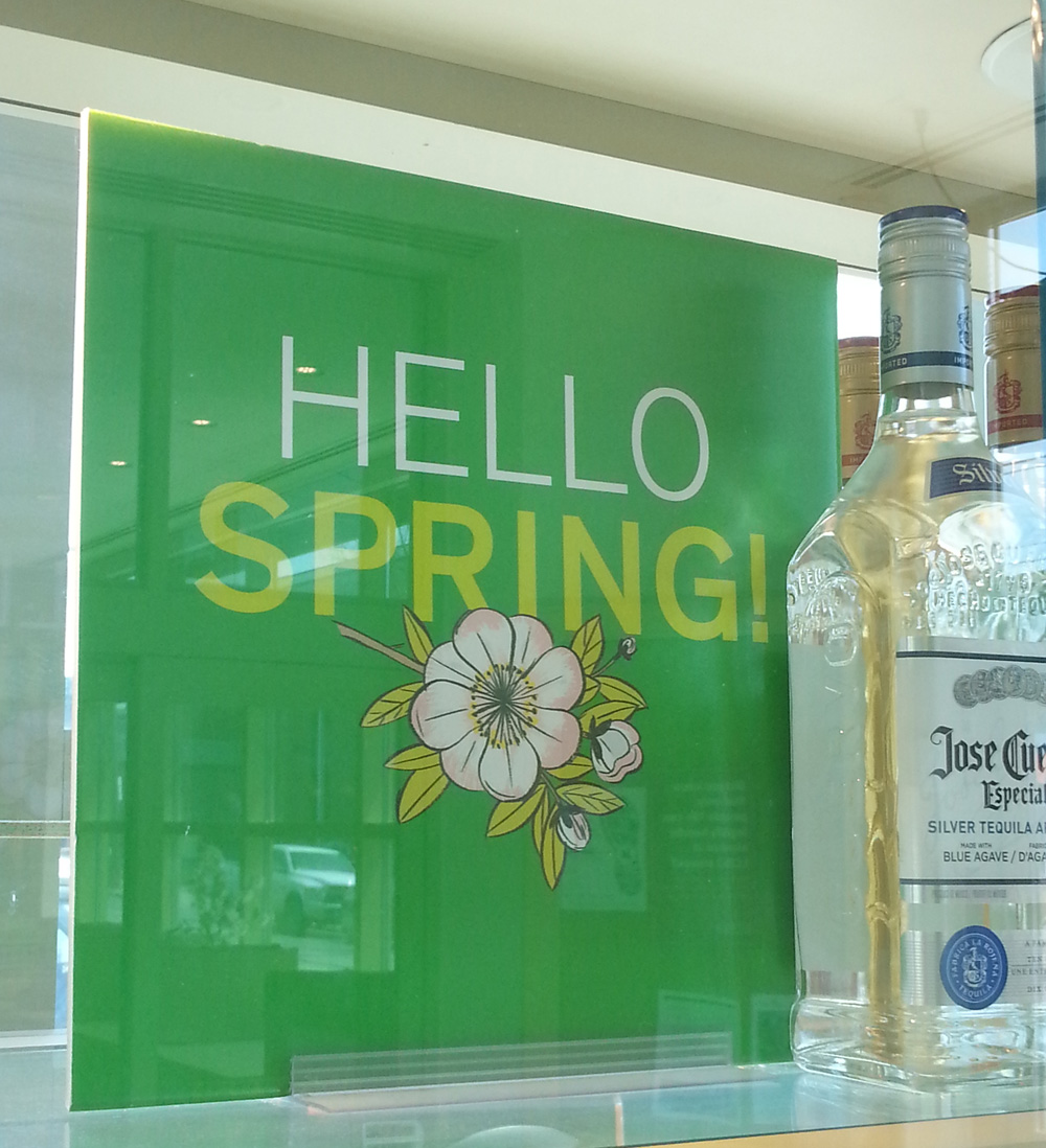


See more of Katy's beautiful work. Represented by i2i Art Inc.
Greg Stevenson's Poster for 'The Audience'
It was great to connect with our longstanding client, art director Wade Gilpin at Rossignol Design, for this special assignment. Illustrator Greg Stevenson, with his ability to create an uncanny likeness, was the natural choice for this poster of Fiona Reid as Queen Elizabeth II in the upcoming Mirvish production of "The Audience". Not a small feat, to create two likenesses in one portraiture, but Greg pulls is off beautifully. With the use of luminous, rich color the illustration is undeniably regal and with that smile Fiona's character shines through.

View more of Greg Stevenson's illustration. Greg is represented by i2i Art Inc.
Phil's handcrafted calendar for Gay Lea Foods
Creative director Andrew Gillingham of Agency59 chose the perfect artist to execute this unique idea to promote Gay Lea Foods' products.
Phil was given carte blanche in building an advent calendar and creating the art that adorns each door. If you look closely at the distressed quality of the construction and paintings you'd swear you were looking at a family heirloom.
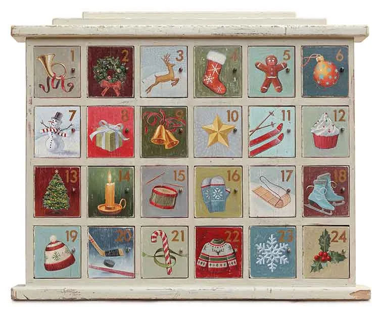
You can see this advent calendar at work in the Gay Lea Foods Facebook app. Each day a new door opens to reveal a festive cookie recipe.

A little imagination is all this illustrator needs to manifest your dream content. Check out more handpainted illustration by Phil the art guy.
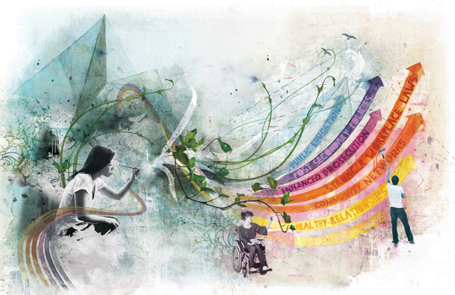
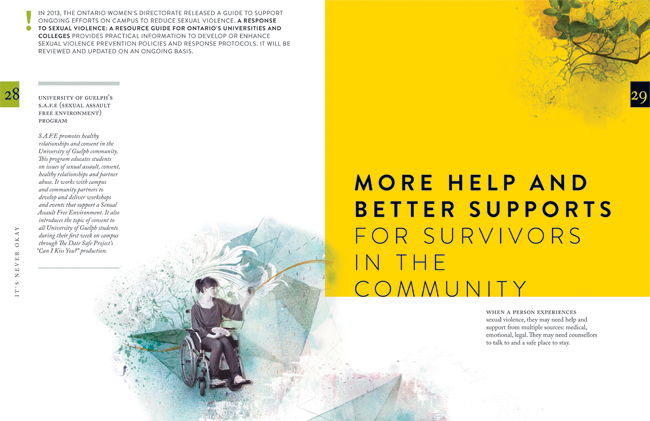
Janice Kun for the Government of Ontario
Janice Kun collaborated with Deirdre Hughes, creative director with Agency59, to create the illustration used for Kathleen Wynne's Government of Ontario Sexual Violence and Harassment Action Plan. Both an honour and a challenge, the art needed to show the optimism the new Action Plan promises, while at the same time representing the struggle and the work to be done on this important societal problem.
To accomplish all of this, Janice's illustration needed to take a conceptual approach in showing the urgency and the action to be taken on the issue of sexual violence and harassment. Through her unique blend of photography, hand rendering and digital collage, Janice's mixed media illustration set out to do all this.

Below in the main double page spread of the report, three figures work together to reshape a landscape that moves rhythmically from the darkness of an abstracted, geometric background, into one of brighter, bolder colours, and organic shapes. Their dialogue sparks the process of change by writing a new script, painting a new horizon, and cultivating new growth.
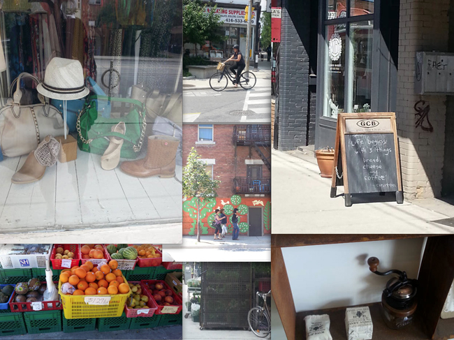
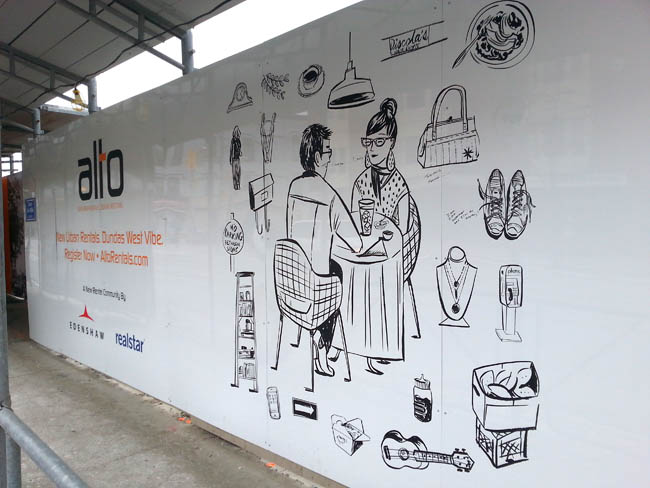
Katy Dockrill for ALTO
Creative director at Drive Agency, Mark Bulloch, chose Katy Dockrill for the ALTO marketing campaign because her illustration style suited the hip lifestyle drawings he envisioned for the brand. ALTO is a gorgeous new rental condo development located in the heart of trendy Little Portugal, in Toronto. The art needed to speak to the young urbanite seeking to live there.
We spoke to Katy about her work on this campaign and she shared some interesting insights on her process:
i2i Art: At the outset, this campaign looked like it would involve four major illustrations and hundred's of small icons. What was your first response to this request?
Katy Dockrill: Firstly, I saw the direction that Drive agency was working towards, because they gave me a preliminary visual concept, and I loved it. I loved the simplicity, the icons, the central figure idea. I love drawing individual things, and because it was black and white, I could simply focus on the line work.
i2i Art: Can you describe your process?
Katy Dockrill: I felt completely at home, taking pictures of the hood, sitting and sketching. I drew from my pictures, once I got home. I also needed to figure out who was going to be in the middle of all these icons, which took more time because the client was looking for someone in a certain age range, and wanted them doing things that might be particular to them and the neighbourhood.
i2i Art: The art needed to be able to reproduce at any size--blown up huge for signage and small for brochures and Internet advertising. Knowing that you sketch and draw by hand, how did you approach the final art to accommodate these specifications?
Katy Dockrill: I knew that these were going to be reproduced at a large size, but I work quite small, with brush and ink. My process in these cases requires I scan all my art as bitmap tiffs and then vector my line work in illustrator so that it most closely resembles the original work.
i2i Art: What's your impression of the finished campaign materials onsite? If you were looking for a rental condo, do the marketing materials portray an appealing lifestyle choice? In what way?
Katy Dockrill: I'm biased in that I really love how the work onsite turned out. I'm hoping with the icons that surround these figures (who are of a certain age range), that they appeal to the bookworm, the foodie, the nester, the cat lover, the musician, the pal, the mother. Since most of what I drew came from life, the sidewalks and the stores in that neighbourhood I also hope that perhaps someone sees a bit of their story in there too.
A montage of photos Katy took while researching the neighbourhood.
One of the panels with Katy's art mounted on construction hoarding onsite.
ALTO advertising with two of Katy's illustrations.

The art I call 'Lunching', up close.

This hipster musician would fit right in at Alto.

A day in the life of a mom.
 To see more of Katy Dockrill's delightful illustrations visit her profile here.
Dave Murray: Illlustration 57 Reception, SOI, NYC
Big congratulations to Dave Murray on his Indie Alehouse poster illustration--Glory & Consequences, selected for the Society of Illustrators' Illustration 57 annual. Last week Dave Murray attended an opening reception of the exhibition at the SOI in NYC. Of this great honor the SOI website says, "the exhibit features works by leading contemporary illustrators worldwide, selected by a prestigious jury of professionals". If you're in New York this month, drop by and check out the show. You won't be disappointed. Details on the show, which runs until January 31, 2015, are on the SOI website.
We caught up with Dave to get his reflections on the experience and share some of his pics from the opening reception:
i2i Art: What comes to mind from the SOI reception in speaking with fellow illustrators and art directors?
Dave Murray: I got a real feeling of community from everyone there. It was my first time at the SOI (and in the annual), so it was a completely new experience. It was pretty amazing just to soak in the atmosphere. I had a bit of a chuckle talking to one illustrator who's work is currently being displayed in the NYC Subway system, but never manages to catch a train that has the work in it. I saw it on nearly every train I took over the few days I was there.
i2i Art: Did any trends or themes emerge for you in looking at the advertising and institutional art on display at the show?
Dave Murray: Themes were harder to nail down - I feel like the SOI does a great job of varying the style of the selections - no one style was represented more than another.
i2i Art: What did you think of the overall quality of the art in the show?
Dave Murray: The quality of the art on display was amazing. Conceptually and technically, pretty much everything blew me away. Going back to the variety of work - there was such a mix of styles and media...Coming home, I feel incredibly re-energized and inspired.
i2i Art: What piece of art by a fellow illustrator was the highlight of the show for you?
Dave Murray: My personal favorite from the show - Andie Dinkins' absolutely unreal "New Years Eve at the Beverley Hills Hotel" piece.
Dave with the poster he designed and illustrated for Indie Alehouse's Glory & Consequences, hanging on those historic SOI walls.


Dave's personal fave, Andie Dinkin's, New Years Eve at the Beverley Hills Hotel.

To see more of Dave Murray's award winning illustration, visit his portfolio here.
Thom Sevalrud for 88 Scott
The vision for 88 Scott : "These are the dreamers, the planners, the creators. ... In the earliest planning stages of 88 Scott, fifteen of the country's leading architects, planners and developers were invited to collaborate in a unique process. Their mandate was to create a bold vision for an exceptional, new landmark condominium building..."
In keeping with this creative approach, art by nine local i2i artists was reproduced in large format and presented on hoarding panels (divided by inspirational quotations). The idea was for the developer to support local talent while beautifying the site during the construction phase of development. The images were chosen to represent the many facets of life in the immediate community: green space, culture, recreation, shopping, entertainment etc.
Over the coming weeks we'll bring you pics of the other panels, but we start today with Thom Sevalrud's. It's fantastic to see the art at this size! If you have a chance, pop down and check out the larger-than-life art at 88 Scott in the heart of downtown Toronto. To see more of Thom's art go here.


©Thom Sevalrud_TS216_i2iArt

©Thom Sevalrud_TS232_i2iArt

©Thom Sevalrud_TS227_i2iArt
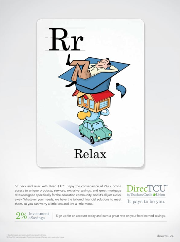
Relax illustration ©Rémy Simard/i2iart
Rémy Simard: 'Rr' for Relax
Here we are mid summer and what better time to do a little of this... 'Rr' for Relax is another ad in the 'alphabet card' campaign for The Teacher's Credit Union. To see more of Rémy Simard's lighthearted illustrations check out his updated portfolio here.
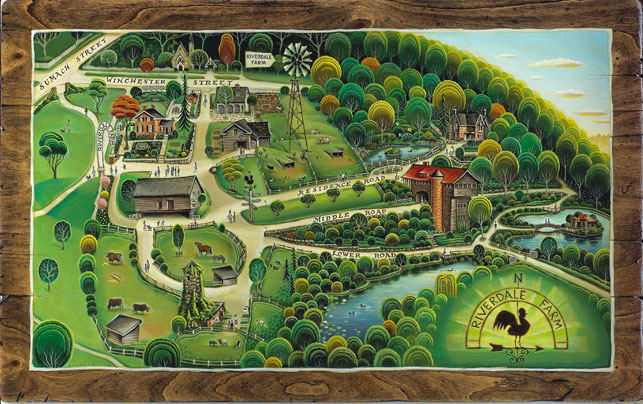
Tim Zeltner for the Riverdale Farm
When the Riverdale Farm's Stewardship Group first approached i2i art to commission a whimsical yet functional map of the Riverdale Farm, Tim Zeltner was chosen for his rich hand painted folk art style (actually painted on wood), and the journey to discover and depict the Farm in all it's wonder began! Below you will see Tim really captures this gem in the heart of downtown Toronto. The map illustration will be used on marketing materials and a give-away map for visitors. To see more of Tim Zeltner's magical paintings visit his updated portfolio here.
Recently I attended the wonderfully successful Riverdale Farm Aid 2014 benefit, which thanks to all the enthusiastic support and dedication of it's volunteers and the community, raised the grand sum of $24,000! At the event, the map (commissioned by the RFSG) and created by Tim Zeltner was unveiled. and large archival prints were auctioned off to benefit the farm.
Tim Zeltner donated the original painting below to The Farm where it will be housed in the main 'Residence'
©Tim Zeltner_TZ444_i2iArt
Below is one of the large archival quality prints Tim donated being auctioned off at the event!

Riverdale_Auction
There was a terrific crowd and the fundraising was a big success!

Riverdale_Audience
An awfully cute wooly resident of the farm, not too bothered by the crowd that night nibbles on some fresh local produce.

Riverdale_Farm_Sheep
The fabulous Lemon Bucket Orkestra: A big hit!

Riverdale_Music_Parade
Tour the Farm, visit the animals and chat with the farmer during daily chores. It's a delightful way to spend a day in the 'country' without leaving the city!
More information here: Riverdale Farm's Facebook page | Riverdale Farm (City of Toronto Web site)
Congratulations to the Riverdale Farm Stewardship Group and thank you for caring so much and working so hard to preserve this very important part of the city of Toronto!

©Monika Melnychuk_MM811_i2iArt
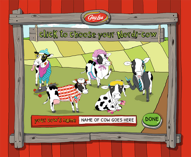
Monika Melnychuk for Nordi-cows Facebook App
Monika Melnychuk is known for her quirky characterizations! Recently Agency59 asked her to create the illustrations for an animated Facebook App for Gay Lea. You choose from the Cash Cow, Smartie Cow, Sleepy Cow, Hipster Cow or Granny Cow and Milk it to win weekly prizes! Wanna play? Go here. To see more of Monika's art-with-a-twist, visit here.
©Monika Melnychuk_MM812_i2iArt

©Monika Melnychuk_MM814_i2iArt
Monika created several frames and additional elements used in the animation. Daytime barn below.

©Monika Melnychuk_MM808_i2iArt
Nighttime barn scene! Like her owl sitting on the rafter?

©Monika Melnychuk_MM809_i2iArt
Rémy Simard: Ad Campaign for Teachers
The Corktown Seed Co., commissioned Rémy Simard to contribute his fun and kid-friendly illustrations to their fresh new branding effort for the Teacher's Credit Union. Here is a sampling of the alphabet cards for the ongoing, 'It Pays To Be You' campaign, art directed by the lovely Cai Li. To see more of Rémy Simard's work visit his updated portfolio here.
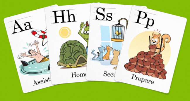
RS690_Card_Spread

TCU Letter Cards ©Rémy Simard/i2iart
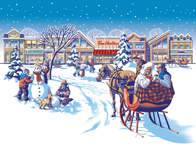
Gary Alphonso for Tim Hortons
Everyone loves Tim Hortons coffee and doesn't everybody notice the art they use on the Holiday cup every year? The answer is a resounding 'Yes', isn't it?
Commissioned by Tim Hortons' branding and design agency, *PIGEON, Gary Alphonso illustrated the art for Tim Hortons' classic holiday campaign! Working with the Pigeon team, the art came together beautifully and was applied to the hot drink cups, bakery bags and boxes.
Everyone was thrilled with how it turned out and we are proud to share with you Gary's art and a few pics of the finished products.
©Gary Alphonso_GA665_i2iArt

Snowman Finished Art 3b

©Gary Alphonso_GA665-a_i2iArt

©Gary Alphonso_GA665-b_i2iArt
Happy Howlidays from Monika Melnychuk!
After illustrating the Dogbook app, Monika Melnychuk was asked by Geoffrey Roche, of Poolhouse Enterprises, to dress up the dogs for the 'howlidays'! Monika had tons of fun doing the illustrations (cards designed by Poolhouse). To check out the poodle sporting a string of holiday bling to the mischievous gift ripping duo, and the adorable Chiuaua aka"Rudolph's brother from another mother", click here to get to visit the Dogbook Facebook page (and while you're there go ahead and send a free e-card to your favorite 'pet'!).

Dogbook Holiday Card illustrations ©Monika Melnychuk/i2iart