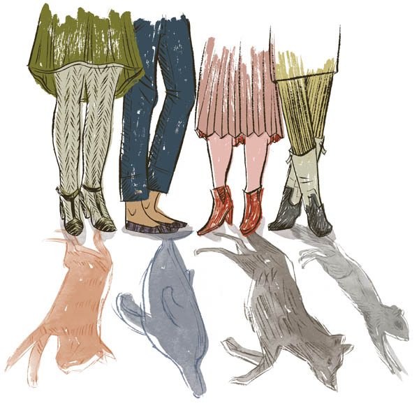
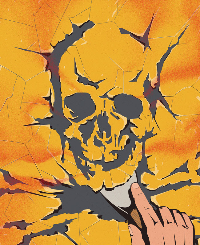
Inspired by ideas, Ane is thrilled at the chance to tackle tough topics. Producing a range of artwork on a variety of subjects, from the climate crisis to mental health, they have a knack for delivering complex concepts with clear and concise visuals. Ane’s illustrations tell a story, with bold colour palettes and graphic shapes guiding the viewer. Whether its a detailed map or a simple visual, Ane definitely doesn’t shy away from making a statement. In fact, they embrace it!
Read More
Welcome illustrator Kuba Ferenc
We’d like to give a warm i2i Art welcome to incredibly talented conceptual illustrator, Kuba Ferenc. Graphically composed and wonderfully compelling, Kuba’s illustration offers a unique perspective. Passionate about communicating complex ideas his work is well thought out and meticulously constructed. Addressing a variety of topics from politics to psychology, Kuba’s sophisticated yet subtle use of forms, shading and colour bring his illustration to life.
Read More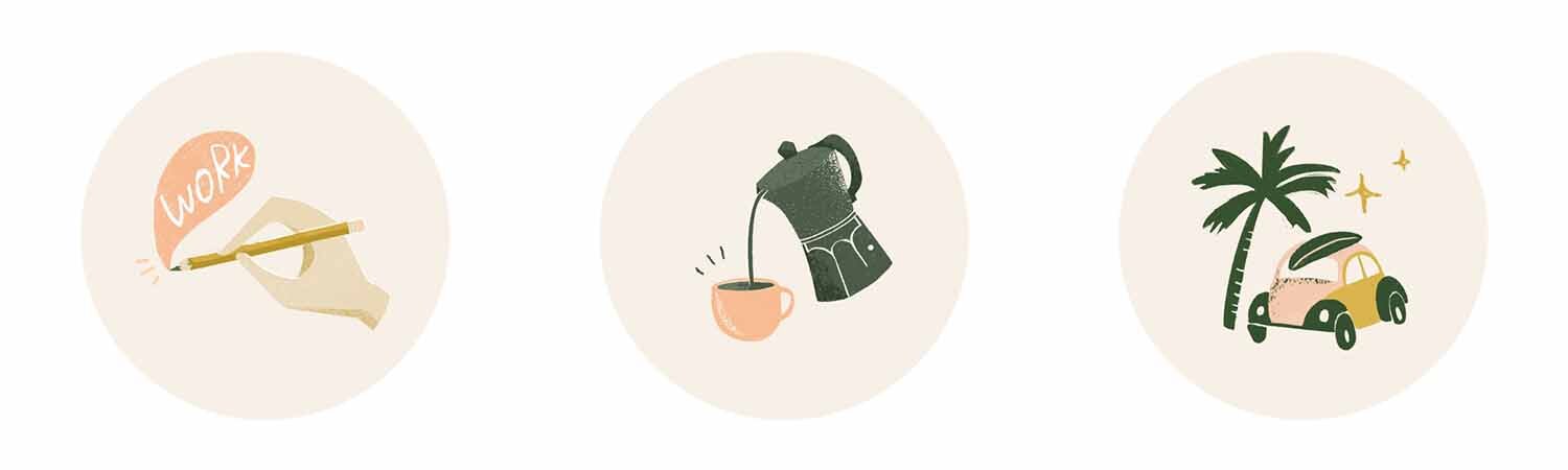
i2i Art welcomes illustrator and animator Kelsey Davis
We are thrilled to announce that our incredibly talented roster of artists is continuing to grow! Please join us in welcoming illustrator and animator Kelsey Davis! Bold shapes, dreamy hues and conceptual creativity are just a few reasons to fall in love with Kelsey’s illustration.
Read More
Meet craft brewery resident illustrator Dave Murray
Illustrator Dave Murray has been quietly creating a impressive collection of award-winning illustration for Toronto craft brewery Indie Ale House and we thought it was about time we shared some of it!
Read More
Carl Wiens' conceptual illustration for Wiley medical journal
Illustrator Carl Wiens has been quietly working away on a series of covers for the Clinical Pharmacology and Therapeutics Journal and the time has come to show off his work!
Read More
Carl Wiens Illustrates for Watershed Magazine
Oh, to move to the country. We've all dreamed it before. Watershed Magazine art director, Meg Botha wittingly commissioned illustrator Carl Wiens (who himself commutes from Belleville to Oakville) to cleverly and colorfully depict what just might be in store for you.
Read More
Eric Chow illustrates for Canadian Business
Canadian Business magazine recently published it's Investor's Guide 2017. With a wonderful mix of metaphors Eric Chow's illustration accompanies some great advice on investment strategies and picking the right stocks and brokerage firm.
Read More
Thom Sevalrud illustrates for Nobles Magazine
In their latest issue, Nobles magazine, published by the Noble and Greenough School, brings us a fascinating look at teens and their social networks. With some exceptional art direction from 2 Communique, Thom Sevalrud's illustration captures our curiosity on the subject.
Read MoreMark Hoffmann for Cooking Light
Not an easy task, illustrating a story about love, loss, and fruit salad. The author and copy director for Cooking Light, Susan Roberts McWilliams, "wanted the article to have a lot of hope and thankfulness to it." Mark Hoffmann's illustration was the perfect compliment to this touching story about how we respond with food when someone loses a loved one.
Delight in the details and composition of these richly painted down-home pieces. Feature art directed by Sheri Wilson and 2015 winner of the SPD merit award for Single/Spread Illustration in the Lifestyle, Travel/Food/Shelter category.

SPD merit award for Single/Spread Illustration

Love, Loss & Fruit Salad

Friends, Family and Casserole

Pot Pie With Love

Home is Where the Slow Cooker Is
Dave Murray for William & Mary
We are in "a new universe of information overload" and our education needs to reflect that. The College of William & Mary was excited to share their strategy for addressing this new age of information and enlisted the help of illustrator Dave Murray to do so.
Featured in the W&M Alumni Magazine, Dave captures the rich potential of a liberal arts degree from this prestigious school. "The liberal arts is, in fact, going to be necessary to navigate the coming world." Dave's colorful palette and mosaic of elements brings out the wonder and complexity William and Mary is preparing it's students for.

Lift Off! An education to prepare you for a new universe of information overload.

A liberal arts degree will be a necessity in navigating the coming world.
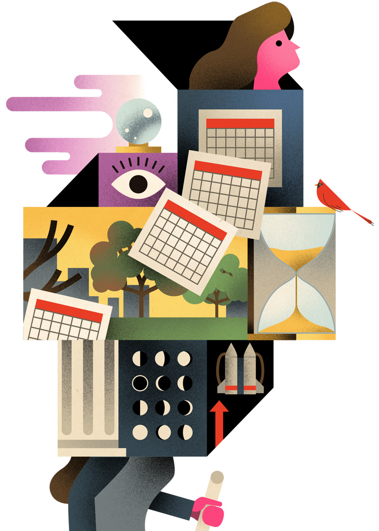
It's a matter of training your mind in a new way.
Carl Wiens for National Underwriter Property & Casualty Magazine
Security for cyber coverage, not an easy subject to illustrate and Tim Schafer, art director at National Underwriter Property & Casualty magazine, didn't want any of the typical metaphors. So conceptual illustrator Carl Wiens created this clever image. What could be a better metaphor for the diligence needed to protect oneself from the creep of cyber threats then the ever-present task of mowing your lawn. With bright color and sophisticated shapes the article demands that the reader take notice and quickly the connection is made - you can't let either lapse.


Additional spot illustrations by Carl Wiens use the same bright palette and intriguing imagery to highlight some key tips.
Let Carl Wiens tackle your next assignment. See more of Carl's work.
Carl Wiens for Global Brief
"To Do or Not To Do" was the inspiration for this cover illustration by Carl Wiens for Global Brief magazine, art directed by Louis Fishauf of Fishauf Design. Carl's illustration perfectly captures the complexity and confusion in the discussion of action vs. inaction when it comes to international crises.

In the same issue Carl was asked to create another powerful piece for the article, "Man and His Economic-Financial Crises." The lowly repairman about to ascend into this massive machine again punctuates the enormity of the issue outlined.
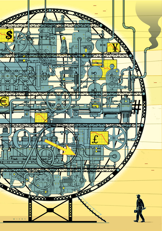
In both pieces, intricate symbolism in the machinery and compasses, a signature of Carl's work, form bold, undeniable visual statements and tell the story in an instant.
See more of Carl Wiens' conceptual illustration. Represented by i2i Art Inc.
Katy Dockrill for SHE magazine
Illustrator Katy Dockrill had the opportunity to contribute again recently to SHE Magazine, published by the Canadian Women’s Foundation.
For this poignant piece on the struggles women still face Katy used the symbol of the quilters. The visual is perfectly paired with a quote by Rosemary Brown, pioneer of 20th century Canadian politics, who devoted her life to the cause of justice and equality for women and minorities.


See more of Katy’s inspired illustration. Represented by i2i Art Inc.
Meet Illustrator Carl Wiens
A versatile artist with lots of clever and curious ideas, gives us a glimpse into the world of his art. Introducing illustrator, Carl Wiens, represented by i2i Art.

This self-portrait titled, Work and Play, is a tribute to the life of an illustrator – chasing deadlines and relaxing with a pint at the end of the day. Image created for a group show at the Land Gallery in Portland.
i2i Art: How long have you been illustrating for a living?
Carl Wiens: I’ve been drawing pictures for as long as I can remember. I started illustrating full time 26 years ago. That sounds like a long time, but my work has evolved an grown over the years. Even after all this time I am always looking for new directions and sources of inspiration.

This signature piece is titled, The Dragonfly Effect: How to use social media for social good. Cover image for the Stanford Social Innovation Review.
i2i Art: Describe a dream assignment?
Carl Wiens: It’s hard to pick a favourite; I work on so many different projects. I like to get involved with a series of images or dive into a book project.
A couple of years ago, I was contacted by publisher Brian Kaufman, and offered the chance to illustrate an entire issue of a magazine, cover-to-cover. SubTerrain is a Canadian arts and literary review, offering short stories, poetry and art. Its tagline is ‘Strong Words for a Polite Nation’. I haven’t had the chance to work illustrate fiction and poetry very often. I reviewed the articles, scribbling down the images springing to mind. I wanted to create strong images to go with the words.
Working on this project was like a night at a gourmet restaurant. One tasty dish after another, each with a different flavour. The work I did for the magazine was recognized by The Society of Illustrators and published in their annual, Luerzer’s 200 Best Illustrators and won a gold medal from the Western Canadian Magazine Awards. Here’s my favourite piece, for a short story by Lee Kvern called ‘Detachment’.

i2i Art: What would be an illustration assignment that you’d love to land?
Carl Wiens: I would love to work on a book project, illustrating a novel or developing visuals of characters and settings for a fictional novel. I have done some fantastic cover assignments for Tor.com and worked with writers like John Scalzi, Rudy Rucker and Bruce Sterling. If I could find the right vehicle, I would love to see my Mecanismos characters developed into a book, animation or app.

Loco – Cover image for a Science Fiction short story, involving organic memory storage, scientists and exploding heads – for Tor.com
i2i Art: What personal interests have most affected the direction you’ve taken with your art?
Carl Wiens: When I started out in the business, I was interested in whimsical illustrations and cartoons. My work matured as I moved through my career, and I was able to add more depth and conceptual strength, expanding into serious subject matter and op-ed illustrations. At a certain point I returned to the subjects that have inspired me throughout my life and decided to focus on nature, science and collage. I alsogot back to producing prints and creating art for gallery shows. That focus has driven my work to new levels and allowed me to establish new assignment work along with greater creative satisfaction.
I like the idea of an eccentric scientist, creating experiments in the lab, as a model for my creations. I think that sense of curiosity and playfulness still informs what I do.

Title: Wavelength – Illustration for NPR calendar – these are the little beings that live inside your radio.
i2i Art: How do you get started with a creative brief for an assignment?
Carl Wiens: It is critical to sit down with paper and pencil and allow things to flow. Sometimes the act of drawing can bring to mind associations and concepts that lead to a series of visuals that solve a problem or arrive at an image that never would have presented itself. I also have an extensive library of old ephemera, encyclopedias and reference books that I can pour through to get inspired. I collect a lot of obscure manuals, vintage textbooks and other sources of odd and unconventional ideas.
i2i Art: Tell us a bit about your process?
Carl Wiens: I work primarily in Illustrator. I know my work doesn’t necessarily look as though it’s vector-based, but it is how I developed my technique and prefer to work with. Vector illustrations give me the flexibility to edit and experiment with colour and balance. I also like the way that the final illustrations can be scaled up or down without compromising detail and resolution.
I always start with pencil sketches and usually present initial concepts as such. I fill in the details once sketches are approved. I ink the drawings, scan them, then vectorize the linework. I can add in other elements from my large collection of vectorized vintage objects and textures. The mechanical elements in my illustrations come from my archives. I spend a lot of time balancing the elements and getting them to work together as a whole. So yes, the finished pieces are often a hybrid of traditional and digital work. I don’t want the pieces to look to digital, unless I am working on small icons or on a quick-turnaround assignment.
i2i Art: You created this illustration for the Work/Life series published by Uppercase. Tell us about this image?
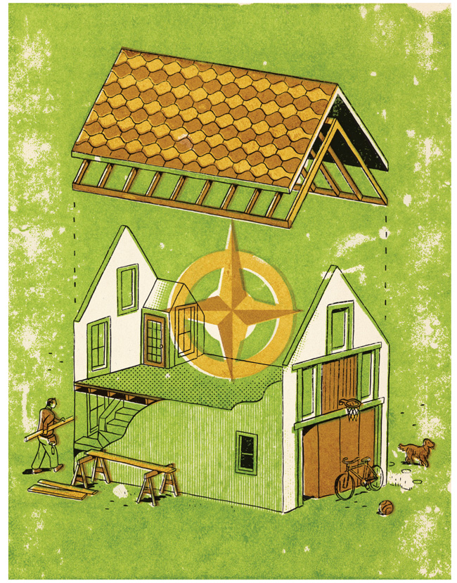
I worked in construction and have done a lot of hands-on labour over the years. I bring a workman-like approach to the things i do. It’s important to understand process, and how to build and image, to plan things out and bring all of the elements together to produce the final. I built my last studio in a dusty old barn. I cleaned it out, re-framed the inside, put in the drywall, wiring, windows and trim. When it was finished, I took a lot of pride in what I accomplished It’s important to have a space you feel is your own, where you feel comfortable and can make things happen.
i2i Art: What was the inspiration behind it this image, which you have available as a print?

I love to cycle, so drawing a bicycle and creating a print was a natural fit. I used a pair of old kids’ bikes as a basis for the drawing. I overlapped the images and screen printed them in different colours on a collaged background. There is a faux 3D feeling to the pieces. Remember the feeling of freedom and joy you had as a kid riding a bike? Those memories get fuzzy over time and this piece is meant to evoke that.
i2i Art: Have you ever worked in animation with your art or had a client animate it?
Carl Wiens: I did some character design for Nelvana when I started out in the business. I also helped to develop and design segments for a show called Freaky Stories. My work lends itself well to motion and it is something that I intend to develop. I recently did a test, with a walking cycle for one of my mechanical collages.

See more of Carl Wiens’ work. Represented by i2i Art.
Thom Sevalrud for The Journal of the Norwegian Medical Association
Thom Sevalrud had the pleasure of illustrating yet another cover for The Journal of the Norwegian Medical Association this past month. Art director Lotte Gronneberg chose the prefect topic for Thom's style.
Thom's piece depicts how technology will change the role of patient care in the years to come. As Thom often does, he gives us the sense of the enormity of these decisions and how very personal they can be.
'Patient Technology' by Thom Sevalrud
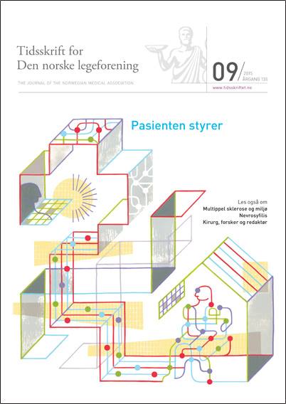
Cover of The Journal of Norwegian Medical Association
See more conceptual illustration by Thom Sevalrud. Thom Sevalrud is represented by i2i Art Inc.
Dave Murray for National Magazine
When tech collides with the standard way of doing things. Illustrator Dave Murray is often asked to visually interpret this concept. Most recently, art director Tony Delitala of Delitala Design, assigned Dave to illustrate two high tech articles for the Canadian Bar Association's National Magazine.
Dave's strong use of symbolism, conceptual intelligence and graphical style invites the reader to dive into these stories.
Technology can help make justice more accessible

Heavy workload? There’s an app for that.

Check out more of Dave's work. Represented by i2i Art Inc.
Eric Chow for Remodeling Magazine
With ever-changing rules and regulations, remodeling you home or office is no picnic. Remodeling Magazine tackled this topic in the feature article "Watch Your Step" for their March 2015 issue.
The design team at Hanley Wood knew a conceptual solution would be best to illustrate the fine line contractors walk between safety and regulations. Illustrator Eric Chow worked closely with them to come up with this clever tightrope analogy.
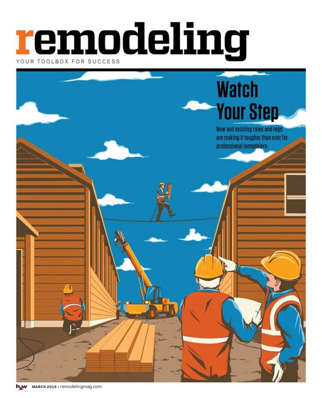
Eric chose to put a menacing face to the dangers of lead paint removal for the inside story.
Looking for a new way to tell your next story? Visit Eric Chow's complete portfolio at i2i Art.
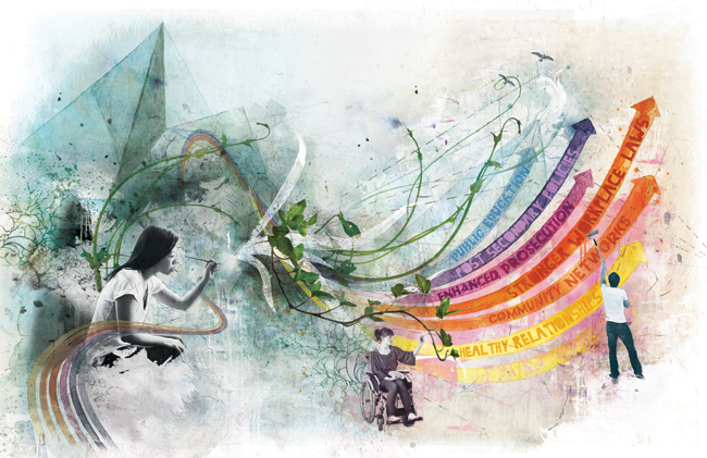
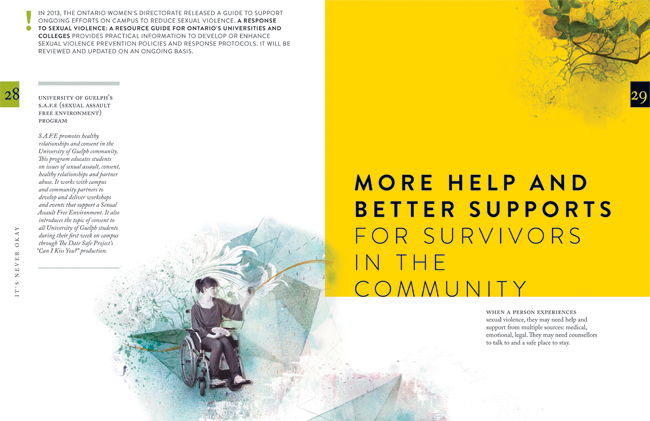
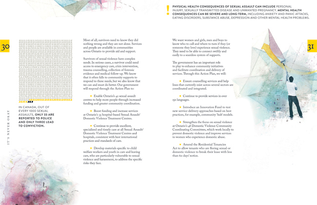
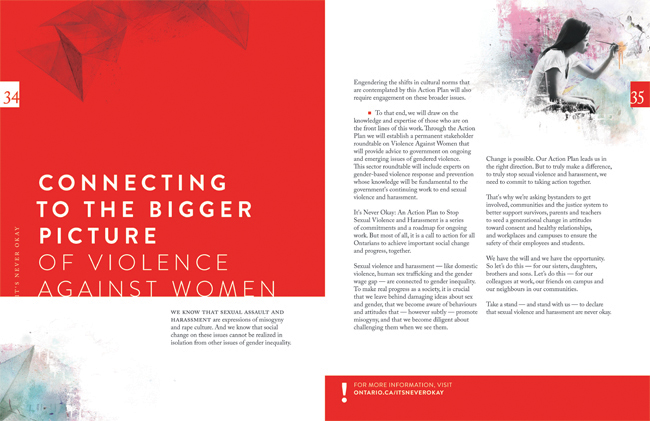
Janice Kun for the Government of Ontario
Janice Kun collaborated with Deirdre Hughes, creative director with Agency59, to create the illustration used for Kathleen Wynne's Government of Ontario Sexual Violence and Harassment Action Plan. Both an honour and a challenge, the art needed to show the optimism the new Action Plan promises, while at the same time representing the struggle and the work to be done on this important societal problem.
To accomplish all of this, Janice's illustration needed to take a conceptual approach in showing the urgency and the action to be taken on the issue of sexual violence and harassment. Through her unique blend of photography, hand rendering and digital collage, Janice's mixed media illustration set out to do all this.

Below in the main double page spread of the report, three figures work together to reshape a landscape that moves rhythmically from the darkness of an abstracted, geometric background, into one of brighter, bolder colours, and organic shapes. Their dialogue sparks the process of change by writing a new script, painting a new horizon, and cultivating new growth.
Mark Hoffmann for D Home Magazine
Ever found your kid hanging from a candelabra or climbing a giant holiday decoration? In his best playful style, Mark Hoffmann illustrated the story Babes in Toyland: Activities that will make your kids' holiday season more merryfor art director Jamie Laubhan-Oliver, at D Home Magazine. If you like this image, there are a lot more fun Mark Hoffmann illustrations here.

©Mark Hoffmann_MH447_i2iArt
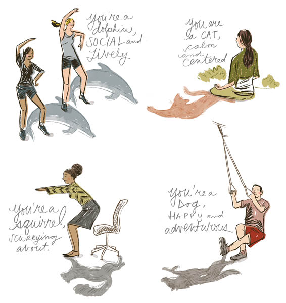
Katy Dockrill illustrates for Diabetic Living
Katy Dockrill created these illustrations for the article: What's Your Exercise Personality, for the Fall 2014 issue of Diabetic Living magazine. I'm a playful dolphin, what are you? For more of Katy's delightful illustrations check out her portfolio.